The workday is done, the school gates are closed, and the weekend is calling. At Connelly Partners, we’ve always known that public transport is the backbone of the daily grind. But when the National Transport Authority (NTA) challenged us to increase off-peak usage, we saw an opportunity to change the narrative.
Reclaim Evenings and Weekend
Most people view public transport as “utility” tools, something you have to take to get to work or school. Our goal was to flip that script. We wanted to position Transport for Ireland (TFI) not just as a commuter service, but as an enabler of Irish social life.
The creative centers on the moments we live for: taking the DART to go dancing with friends, the TFILocalLink to GAA training, the Bus to the bingo hall, and the Luas for leisure at the local pool. By highlighting these specific, relatable Irish pastimes, we shifted the focus from the destination to the experience.
We leaned into high-energy visuals and a bright, summer-ready palette. We didn’t want static scenes; we wanted movement. To capture that energy, we worked with the dynamic crew at Bad Coyote to film all eight campaign scenes in a single, high-octane day.
The campaign is currently live across Ireland, spanning a heavy digital presence on YouTube and social channels, supported by OOH (Out of Home) rollout. As we head into summer, we’re proud to help TFI show Ireland that the network is there for more than just the commute; it’s there for your spare time.
When a Soul Is Moved, All Is Forgiven
Will Burns, Chief Growth Officer
In today’s complex, overstimulated, multimedia world, it’s not enough to be “convincing” and expect your audience to act. We believe the only way to move people’s feet—the tangible actions like visits, signups, and loyalty—is to move their souls first. Everything we do at Connelly Partners is designed accordingly. What you may not know is that there is a seriously powerful fringe benefit for a brand when it successfully moves souls. That is, immunization from harm.
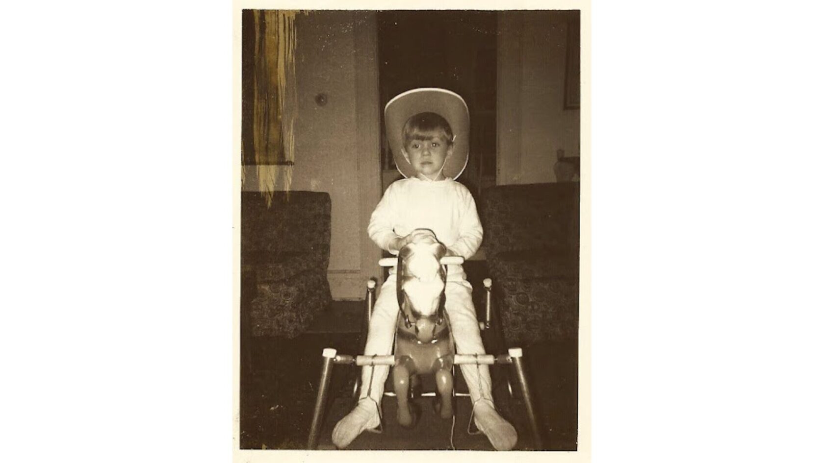
Let me give you an exaggerated example. When I was 3 years old I was moved by the Beatles song, “Hey Jude.” Believe it or not, I still remember the day my older brothers summoned me and put the headphones on me and said, “Listen to this.” I did and I was transformed.
I would sing it while rocking on my rocking horse with my cowboy hat on. Seriously, there’s a picture. I became obsessed with the song, then obsessed with the Beatles in general. It was a profound “branding” experience for me. The Beatles moved my soul and that moved my feet, listening to more records, identifying new favorites, buying posters, you name it.
But you know what else it did? It immunized my favorite Beatle, Paul McCartney, from his many lame albums post-Beatles. I was able to suffer through the albums “Wildlife,” “Give My Regards To Broadstreet,” and “Pipes Of Peace,” because my soul was already moved to such a degree. This is not to say Paul didn’t have any good albums, he did. “Band On The Run,” “Back To The Egg,” and “Ram” were classics. But my point is, I was able to endure the flops because once a soul is moved, there’s no turning back.
That’s a personal story, but there are plenty in the marketing space. Remember that wonderful “Think Different” campaign from Apple way back when? Here’s the genius “Here’s To The Crazy Ones” TV spot that Chiat Day created that highlighted all the “crazy ones” from humanity’s past. Apple planting a flag firmly into rebel territory and this beautiful spot truly moved souls. But what’s ironic about this spot is the timing. It came out just after Steve Jobs returned to save the company he started and you know what? The Apple product assortment had become a disaster while he was out. And Jobs, in his infinite wisdom, must have known that in order to retain any of the remaining Apple fans, he’d need to avoid product and instead move souls.
And boy did he.
That one spot, I’d argue, immunized Apple from certain negative perceptions about the products to extremely positive perceptions about its brand. Forgiveness was the result, and in abundance.
More recently, look at Patagonia. I’d wager they could come out with a new line of flawed jackets that fall apart after one wear and it would only start a trend for disposable jackets. Patagonia has moved souls to such a degree with their commitment to environmental well-being that it would take a lot of flops to tarnish the brand in any significant way.
So we as marketers could continue to try convincing the world that this product or this feature is better than that product or that feature. Or we can set our sites higher and try to move souls. That’s our mission.
Because, heck, moving souls not only immunizes brands. You might say it takes a sad song and makes it better.
The Gift of Time: Outsourcing Influencer Management is Essential for Today’s Brands
Neal Malone, Director of Social Media, Influencer Marketing, and PR
For most people, hiring a house cleaner doesn’t feel right. Why would you pay someone a few hundred bucks every few weeks to complete the household tasks that you can do yourself? It’s an age-old question.
But then, life happens. The job becomes more demanding, the weekends get swallowed up by events and activities, and that full basket of laundry has been sitting at the bottom of the stairs for a week.
Suddenly, outsourcing these tasks doesn’t seem so crazy anymore. People begin to realize that if they want to focus on their true priorities, hiring a house cleaner is an easy remedy. After all, it’s really time that they’re after—and time has significant value.
You know what influencer marketing is? It’s a big, messy house that takes hours and hours to clean. And sure, brands can do it themselves without help from an outside agency—but at what cost? To truly maximize your investment in influencer partnerships, it takes time. So much time. I know this because my job is to absorb all that labor-intensive influencer work from clients so that they don’t have to remain in the weeds.
Hiring an agency like Connelly Partners to build and manage your influencer program is giving yourself the gift of time—and in turn, the ability to focus on other business priorities. Just like a house cleaner, our influencer expertise has a price tag, but brands are actively looking for ways to get internal hours back. And quite frankly, they’ve started to realize that the house sparkles that much more when you leave it to the professionals.
Ok, so you’ve decided to hire an agency to run your brand’s influencer program. Now what?
There are tons of influencer SaaS platforms and influencer-only agencies out there—and they’ll all sell you on access to a database of millions of influencers and a managed service offering. This type of big-box influencer assistance can totally work for large, established brands that are activating partners at massive scale. But for most other brands, a more hands-on approach is required. Budgets aren’t endless, campaigns are more niche, and brand awareness hasn’t even come close to reaching its peak, making it absolutely critical to find the right influencer partners.
That right there, folks, is what makes Connelly Partners’ dedicated influencer practice different.
Everything we do is customized to the client’s needs and goals, every influencer partner search is unique and based entirely on the campaign brief, and the team takes on every step of the process—from writing the brief and contracting influencers to shaping the content deliverables and measuring performance. Plus, as an integrated agency, our influencer programs are seamlessly weaved into paid social campaigns and measurement strategies, ensuring that the content is reaching target audiences and tracking towards all of the brand’s core KPIs.
That house cleaner is sounding a lot better now, isn’t it? Just do us a favor, though—when you go to make your agency hire, do your research. Don’t just look for the biggest name. Find someone who is actually going to dust the top half of the blinds and pull out the chairs when they vacuum. That’s what we do.
The New Expressway Fleet
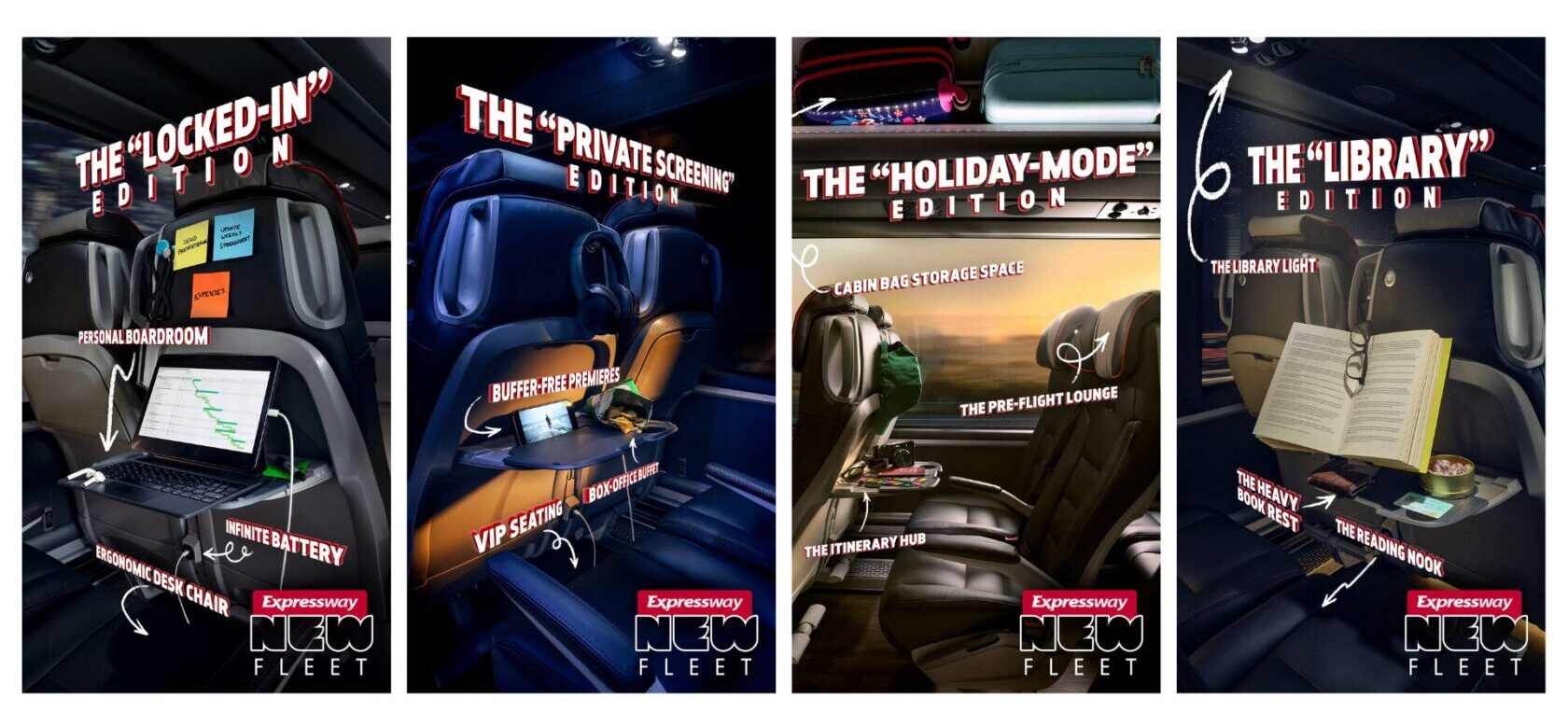
When Expressway asked us to announce their new fleet, the objective was clear: move beyond the traditional “new vehicle” specs and focus on the human experience. While the technical upgrades, like 5G connectivity, integrated power, and ergonomic design are impressive, Expressway’s true value lies in what they enable the passenger to achieve.
Our creative strategy centered on the idea that travel time shouldn’t be “dead time.” Whether you are a professional, a student, or a holidaymaker, the new fleet provides a bespoke environment tailored to your needs.
Rather than a standard gallery of bus photos, we developed the “Editions” concept. This series of visuals transforms the coach interior into specialized zones: a personal boardroom, a private cinema, a quiet library, and a pre-flight lounge. By highlighting features like “Infinite Battery” and “Buffer-Free Premieres,” we shifted the narrative from the mechanics of the journey to the quality of the time spent on board.
The visual language of the campaign uses cinematic lighting and bold, 3D typography to signal a new era for the brand. We wanted the assets to feel premium and modern, reflecting the significant investment Expressway has made in passenger comfort.
With a focus on total personalisation, we’ve positioned Expressway as a lifestyle enabler rather than just a transport provider. We are proud to have partnered with them on this launch, helping to redefine what it means to travel by coach.
Gen Z in Their Own Words: Insights from Our Latest Women’s Panel
Maya Menon Freeman, Brand Strategist
For Connelly Partner’s most recent Women’s Networking Event, I moderated an incredibly thoughtful, candid panel of young professionals.
The intention was simple: create space for unfiltered perspectives that challenge generational assumptions. We got a look inside what moves Gen Z’s souls, and ultimately moves their feet to purchase. Here are the takeaways that have stayed with me:
Gen Z’s Favorite Brands Go Beyond Affinity
When panelists shared their favorite brands, the common thread wasn’t aesthetics or product quality, it was deep investment in their customer base. Gap felt like it was “talking with Gen Z, not talking at us,” and Guinness stood out for consistently giving back to its community. Topicals earned praise for formulating skincare “with melanated skin in mind first” and constantly improving from consumer feedback.
Gen Z doesn’t just want to buy from brands, they want to feel valued by them. This requires intentional effort to understand consumer mindsets, because when brands move people on a deeply human level, action naturally follows.
Authenticity Isn’t Dead, it’s the Litmus Test
This sparked one of the most nuanced debates of the evening: On one hand, there’s fatigue around recycled trends that has made authenticity feel hollow. But the counterpoint was sharper: Authenticity isn’t disappearing, it’s getting harder to fake. “Trying to be authentic is literally the opposite of authenticity,” one panelist noted, emphasizing how quickly Gen Z can detect when something feels manufactured.
The baseline isn’t performative relatability. It’s consistency, originality, and self-awareness.
Brands Need to Talk the Talk andWalk the Walk
Real trust comes from follow-through, and a brand’s refusal to engage with big issues means “you lose that human connection, and you’re not actually caring about the people that you’re making products for.” Whether it’s Topicals reformulating a serum based on feedback or brands protecting their workers, clear action supported by storytelling is what differentiates.
It’s important to note, subtlety can outperform spectacle. Brands like Patagonia, who embed their values into operations, often feel more credible than those loudly shouting them.
Fulfillment Is the Ultimate Goal
For Gen Z, fulfillment isn’t a luxury, it’s a requirement. This shows up both in how they consume and how they work. It lives “in the small activities…your morning coffee…your evening run.” One panelist shared that they left a stable corporate role because it conflicted with personal values, choosing instead to “actually connect with humans again and do something I love.”
While this is often seen as disengagement, in truth it is a practice in intentionality. In a world of constant information and instability, fulfillment becomes a form of control and acts as a north star.
Trust Gen Z to Lead the Conversation
If you want to reach Gen Z, involve them meaningfully. “Don’t just have us present, have us involved entirely from start to finish.” Representation without influence is easy to spot, and campaigns can easily fail when Gen Z doesn’t have a seat at the table.
Young people are increasingly undervalued in AI-driven environments, but to create work that resonates, you have to trust their voices. “Pick our brains…that’s why we’re there. If you want our fresh perspectives, just ask.”
Across different perspectives, it’s clear: Gen Z isn’t looking to be convinced, they want to be seen. They’re active participants who are quick to question, quicker to disengage, and determined to shape what comes next. By understanding what moves their souls, whether it’s authenticity, fulfillment, or trust, we can define the catalysts that truly move Gen Z’s feet.
Check out a clip from the event below!
Welcome to the Era of the Unpolished Brand
Jane Amendolara, Sr. Public Relations, Social Media, & Influencer Marketing Manager
There’s no secret sauce to brand success, but there was a time when polished content was the gold standard. Perfectly staged shots, 100% branded messaging, and scripted lines were how brands proved they were “serious.” Scroll through a Gen Z social feed today, though, and that level of polish often reads as stiff, distant, or … try-hard.
It’s not a sudden change. Social-first platforms have steadily nudged audience expectations toward a more unpolished, authentic style. While polish still has a time and place across the broader marketing mix, what was quietly emerging is now unmistakable in 2026: on social, relatability beats perfection every time.
Welcome to the era of the unpolished brand, where scrappy is the new serious.
Gen Z grew up online. They know what “real” content looks like because they make it themselves in minutes. They can spot a scripted or overproduced video in half a second. It’s not about production quality; it’s about authenticity. Overly polished content can make a brand feel like it’s managing perception rather than participating in culture. And participation? That’s what Gen Z actually values.
TikTok didn’t just change the look of content. Over the last several years, it’s changed the feel of it. Brands aren’t just competing with other brands anymore; they’re competing with a five-second meme, a chaotic storytime, or a random relatable comment that somehow lands perfectly. The algorithm rewards resonance, relatability, and timing. Not polish.
All of this means it’s time to rethink the brand book. Social-first brands need a new layer of guardrails that let teams move fast, lean into humor, respond in real time, and flex with trends. It’s not chaos. It’s strategic looseness, where the post is only the start. That’s because real engagement happens when a brand participates by joking along, acknowledging feedback, or even using the comment section as creative inspiration for future content. Huge brands like Dunkin’, for example, do this all the time, by sharing memes and posts that look like a five-year-old could have created them on an iPad. That’s how brands become relatable; they lean into the joke to build a real connection.
Scrappy content doesn’t mean you’re being lazy. Done right, it signals confidence: “We get the platform. We trust our team. We’re here to participate, take risks, and show up in unexpected ways.” When a brand intentionally lets go of perfection, the payoff isn’t just likes or shares. It’s cultural relevance.
ESB Networks & Connelly Partners Launch New Campaign to Simplify ‘Demand Side Flexibility’
We’ve just launched a new integrated campaign with ESB Networks to help the Irish people better understand a vital but often technical topic, Demand Side Flexibility. This is the idea that when we use electricity matters, and by making the most of off-peak times, we can all take a little pressure off the electricity network.
Rather than relying on industry jargon, the campaign boils it down to a simple, human truth: It’s simply a matter of time. Highlighting that by shifting high-energy tasks to off-peak hours, like checking the time before putting on a wash or charging an EV, consumers can collectively take the pressure off the national electricity network.
The creative platform uses a distinct split-screen format to demonstrate how these small, mindful changes fit seamlessly into daily life. To ensure the message reached every corner of the country, the agency developed three bespoke executions tailored specifically for Home, Farms, and Businesses.
“Demand Side Flexibility is a complex concept, but the solution is actually very human and simple. Our goal was to show that by making small, simple changes in our routines, we can all have a major impact on the grid. And we used a split-screen device to keep the message clear and distinctive across every format” Sam Moorhead, Creative Director, Connelly Partners
The fully integrated campaign is live across VOD, OOH, DOOH, and Radio, supported by a comprehensive suite of social-first assets including 9:16, 4:5, and 1:1 formats.
We couldn’t let March pass without sharing some new basketball work—especially when it involves the great state of Connecticut.
Our client, Liberty Bank, entered the NIL world with a big splash, partnering with Connecticut women’s hoops star Sarah Strong. The CP and Liberty Bank teams spent an early March afternoon with Sarah in New Britain, shooting a collection of social videos that have been rolling out as the big games have unfolded.
The highlight, without question, was Sarah surprising the New Britain High School girls basketball team as they prepared for the state playoffs. Talk about a perfect fit for Liberty Bank’s #BeCommunityKind brand platform.
Keep an eye out for more videos as Sarah and her teammates hit the home stretch!
Is Your Dashboard Reporting Growth or Just Noise?
Jen Hansen, Director of Analytics
Most CMOs are making million-dollar decisions based on fiction.
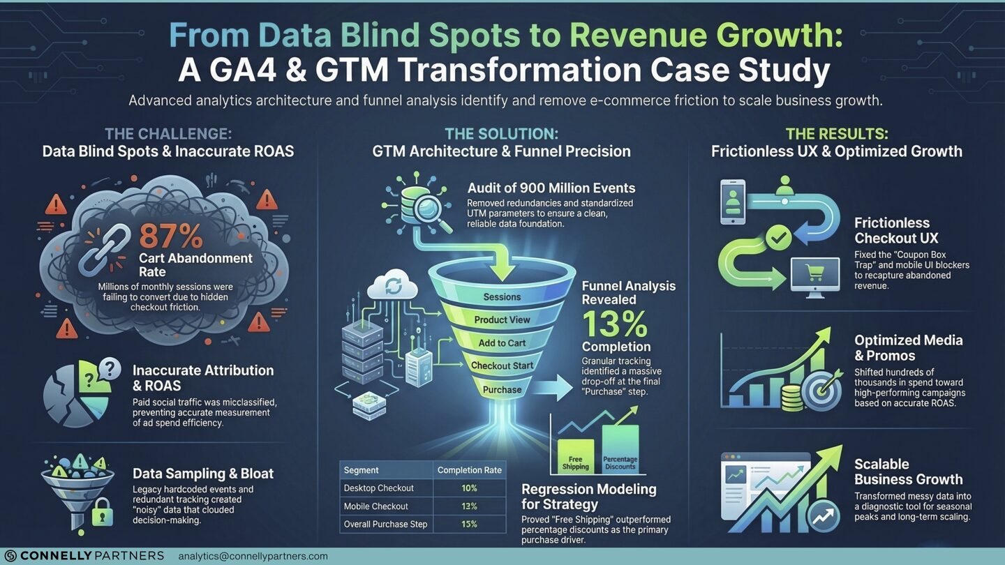
If your GA4 is showing “Unassigned” traffic, sampled data, or a disconnect between ROAS and bottom-line revenue, you don’t have a marketing problem—you have a data architecture problem. But on a deeper level, you have a connection issue: you can’t see if you’re actually reaching people.
The Reality: Your Tracking Is Leaking Revenue
The shift to GA4 left most brands with a “Frankenstein” setup: bloated Google Tag Manager (GTM) containers, duplicate triggers, and broken attribution paths. This isn’t just “messy data”—it’s a blind spot that hides where your customers are actually dropping off.
We recently audited a premier retailer with 900 million annual events. Their data was so noisy they couldn’t see that their final purchase step had a staggering 87% abandonment rate. Something was stopping customers in their tracks.
The Diagnostic Audit
You wouldn’t greenlight a $500k media spend based on a “hunch.” Why rely on a tracking setup you haven’t verified?
Our Analytics Audit is designed to transform raw data into Actionable Intelligence. We don’t just look for broken tags; we perform deep behavioral analysis to find the “Why” behind the “What”:
The Promo Code Trap: We discovered that an open coupon box was “inviting” users to leave the checkout to find discounts, killing conversion.
Mobile Friction: We identified unclickable UI elements on mobile—where 70% of their traffic lived—that were invisible in standard reports.
Strategy Shifts: Our regression modeling proved that “Free Shipping” drove more revenue than category discounts, allowing the brand to pivot their entire promotional calendar toward what truly moves their audience.
Stop Guessing. Start Scaling.
Once we sanitized the data stream and stabilized the tracking architecture, the results were immediate. We didn’t just “fix the tracking”; we gave the brand a roadmap to recapture lost revenue and scale media spend with 100% confidence in their ROAS.
Your data is either your greatest asset or your biggest liability. It is the proof that your work is moving people forward. Before you spend another dollar on ads, let’s ensure you can actually track the return. Interested to see what we can do for you? Send us a note.
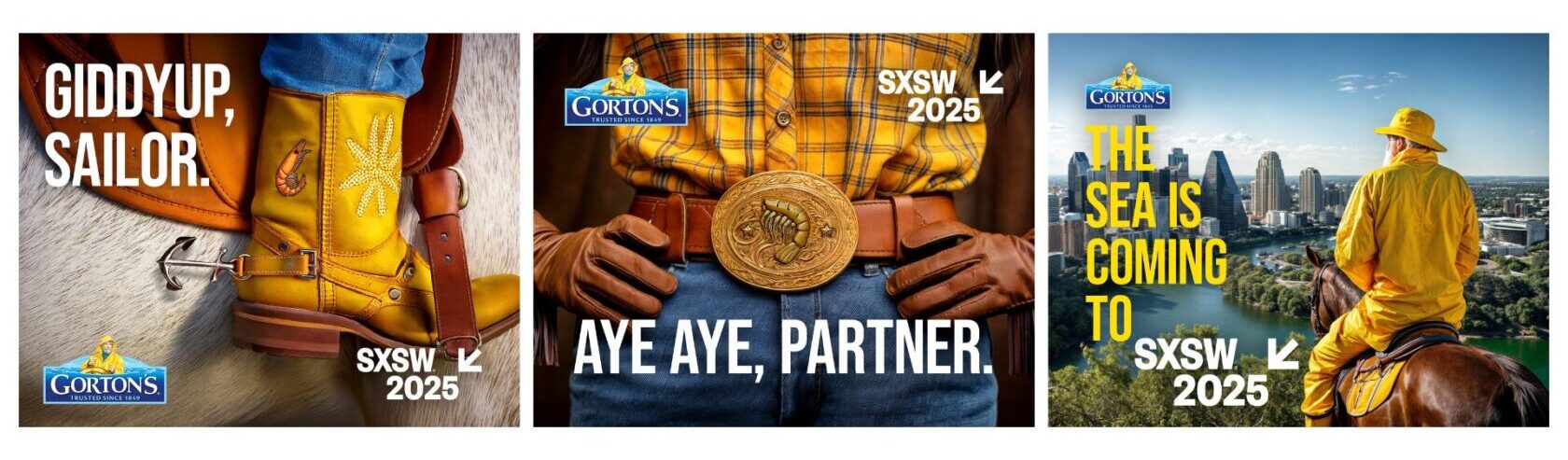
More Than A Moment: Designing the Gorton’s Shrimp and Cocktail Experience at SXSW 2025
There’s a specific feeling you get when a brand experience is done right. It feels less like marketing and more like discovery.
At Connelly Partners, we know that moving feet to purchase requires moving souls first. Modern consumers don’t fall in love with brands because they are told to. They fall in love because of how a brand made them feel in a moment: seen, welcomed, surprised, connected.
So when we were tasked with the challenge to bring Gorton’s Seafood to a younger audience in a way that felt authentic and modern, we knew they needed to discover and experience the brand for themselves.
We believe Gorton’s isn’t in the frozen seafood business. It’s in the surprise and delight business.
We’ve had Gorton’s show up in unexpected places in consumers’ lives – whether in a new recipe, on the grill at a tailgate, or on an influencer’s sweatshirt from our merch store.
But this time we needed to go bigger.
So why not go where everything is bigger? …Texas.
Each March, hundreds of thousands of people descend on Austin for South by Southwest, featuring seven days of connection, discovery, and culture-shaping creativity. SXSW is best known for its conferences and festivals that celebrate the convergence of tech, film, music, education, and culture. It’s known as the place for discovering the next big thing.
“It’s been called a rite of passage, a whirlwind, and even a new world. But above all else, SXSW is a stage for storytellers, a platform for boundary-pushers, and a place where authenticity and innovation thrive.” – SPIN Magazine
With over 450 brands activating at the festival each year, it’s one of the hardest environments for a brand to stand out. Everyone is competing for the attention of a highly influential audience (one that is famously resistant to being sold to). To succeed here, brands must earn the attention, not demand it.
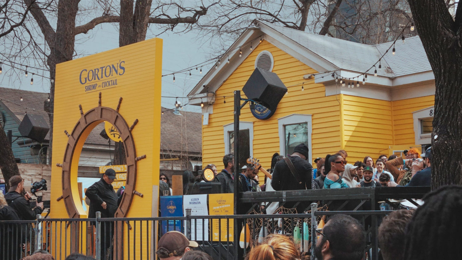
To create that lasting impact, we couldn’t half-ass it. Flopping on a stage of this magnitude was not an option. If our event didn’t blow away our audience, they’d leave with a worse opinion of the brand. So we decided to host a massive party far from coastal New England Gloucester all the way in Austin, TX.
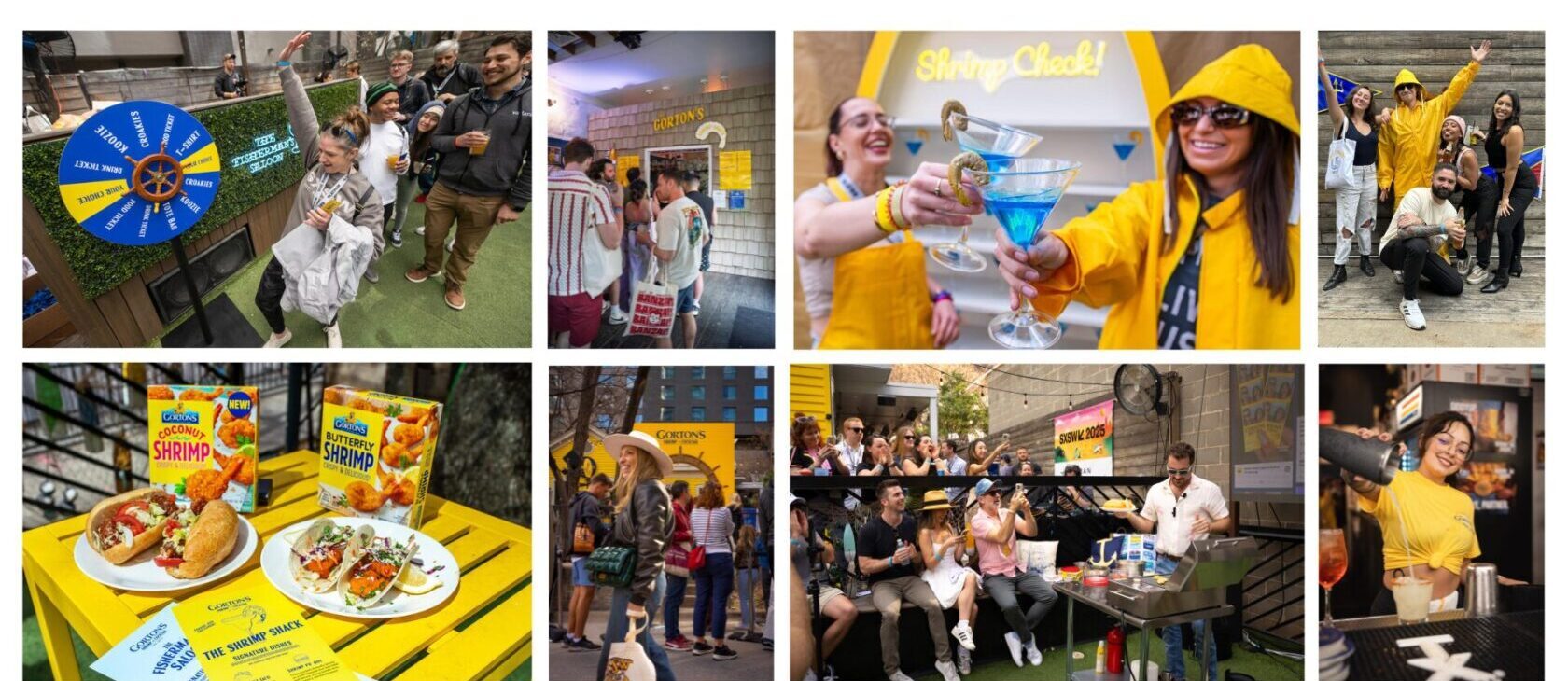
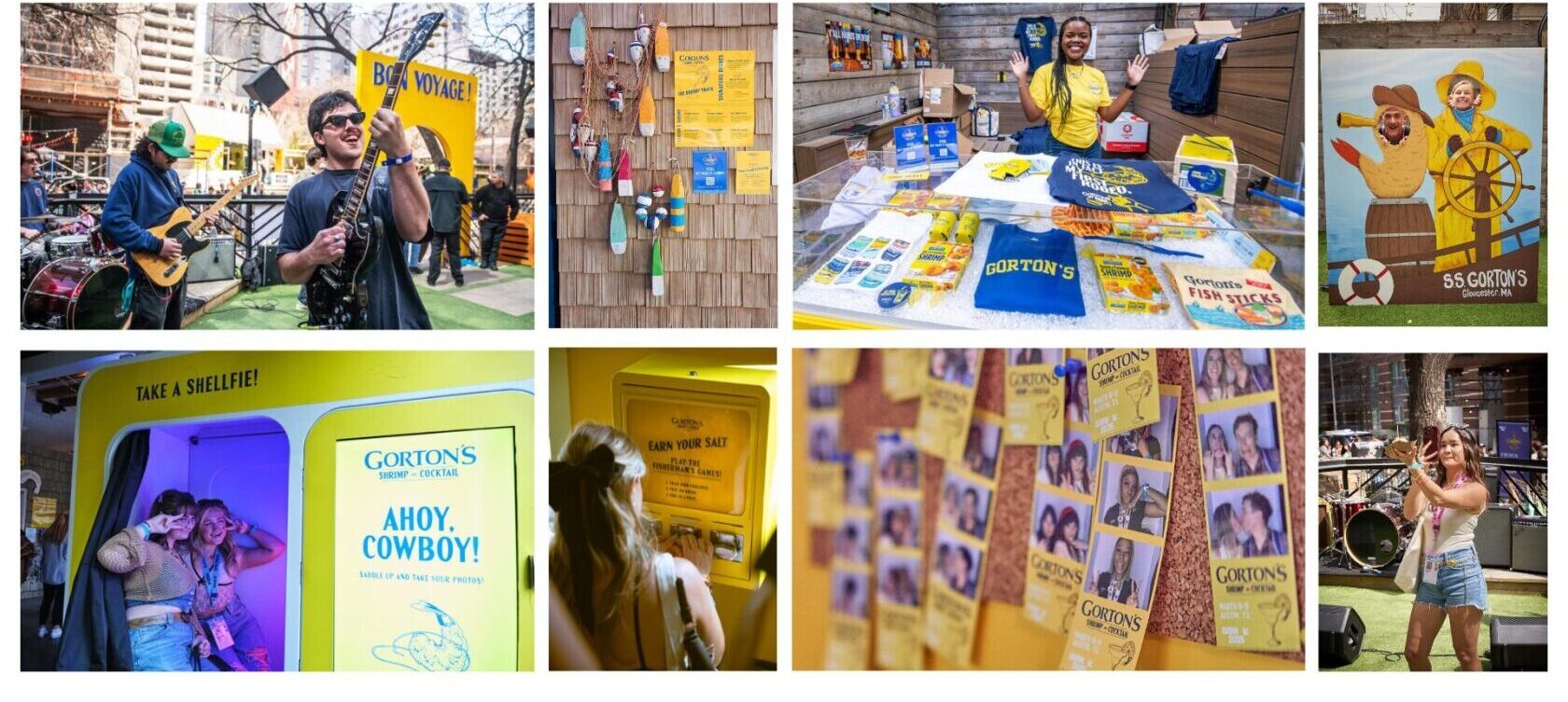
We brought Gorton’s Shrimp & Cocktail to life through a full branded house takeover on Rainey Street, creating an authentic slice of Gloucester infused with Austin’s energy. The home was wrapped in Gorton’s bold and iconic yellow, instantly recognizable from the street, while a massive ship’s wheel archway welcomed guests inside.
The visual design had to be clever and aesthetic enough to surprise our audience, leading to sharing the Gorton’s brand into the world as walking advocates.
Signage and merch included things like shrimp being lassoed and lines like “Ahoy, cowboy!” and “This is, in fact, my first rodeo.” We carried the theme through every last detail, down to the “Buoys” and “Gulls” bathroom signs, and a menu of custom cocktails inspired by the New England brand. (Cape Ann Codder, anyone?)
Every element of the event needed to foster that feeling of connection, community, and discovery that we know this younger audience craves. Up and coming bands played throughout the day in the front yard. Our Shrimp Shack served tacos, sliders, and shrimp samples paired with custom cocktails, while daily live cooking demonstrations from popular influencer @theShaySpence showcased how simple and modern the product could be. Each room offered a unique interactive moment. An analog photobooth encouraged guests to pin photos to the wall to create a living mosaic of the diverse community who experience the brand. A hands-on activity dispenser sparked spontaneous interaction between guests.
When an experience creates surprise, warmth, or connection, it stops being marketing and starts becoming a memory.
We had a line down the block all day, both days of the event. Beyond Texas we had millions of social impressions before, during, and after the event. Attendees didn’t just share content. They endorsed the brand, signaling to their own communities that Gorton’s is full of unexpected possibilities.
This was more than a branded activation. It was a cultural moment and a powerful step forward for a brand ready to evolve. We transformed a brand once seen as predictable and outdated to one that shows up in surprising and culturally relevant ways, on people’s plates and in their lives.
That’s what it means to move souls in order to move feet.
Join our mailing list
Manage Consent
To provide the best experiences, we use technologies like cookies to store and/or access device information. Consenting to these technologies will allow us to process data such as browsing behavior or unique IDs on this site. Not consenting, or withdrawing consent, may adversely affect certain features and functions.
Functional
Always active
The technical storage or access is strictly necessary for the legitimate purpose of enabling the use of a specific service explicitly requested by the subscriber or user, or for the sole purpose of carrying out the transmission of a communication over an electronic communications network.
Preferences
The technical storage or access is necessary for the legitimate purpose of storing preferences that are not requested by the subscriber or user.
Statistics
The technical storage or access that is used exclusively for statistical purposes.The technical storage or access that is used exclusively for anonymous statistical purposes. Without a subpoena, voluntary compliance on the part of your Internet Service Provider, or additional records from a third party, information stored or retrieved for this purpose alone cannot usually be used to identify you.
Marketing
The technical storage or access is required to create user profiles to send advertising, or to track the user on a website or across several websites for similar marketing purposes.
To provide the best experiences, we use technologies like cookies to store and/or access device information. Consenting to these technologies will allow us to process data such as browsing behavior or unique IDs on this site. Not consenting or withdrawing consent, may adversely affect certain features and functions.
Functional
Always active
The technical storage or access is strictly necessary for the legitimate purpose of enabling the use of a specific service explicitly requested by the subscriber or user, or for the sole purpose of carrying out the transmission of a communication over an electronic communications network.
Preferences
The technical storage or access is necessary for the legitimate purpose of storing preferences that are not requested by the subscriber or user.
Statistics
The technical storage or access that is used exclusively for statistical purposes.The technical storage or access that is used exclusively for anonymous statistical purposes. Without a subpoena, voluntary compliance on the part of your Internet Service Provider, or additional records from a third party, information stored or retrieved for this purpose alone cannot usually be used to identify you.
Marketing
The technical storage or access is required to create user profiles to send advertising, or to track the user on a website or across several websites for similar marketing purposes.